Metaseed is a data provisioning service, providing users with live, on-demand data for their customers.
I was tasked to give the website and social media a brand refresh. We had decided that we wanted to focus on icons, and move away from illustrated characters.
I also focused in on the existing colour palette to make it instantly recognisable and differentiate it from its sister-company branding.
I was tasked to give the website and social media a brand refresh. We had decided that we wanted to focus on icons, and move away from illustrated characters.
I also focused in on the existing colour palette to make it instantly recognisable and differentiate it from its sister-company branding.

Social post 1
Social post 2
Social post 3
Social post 4
Social post 5
Whilst still under construction, you can see how the direction of my updated branding
is influencing design of the new site created by the UX/UI designer - see below:
is influencing design of the new site created by the UX/UI designer - see below:
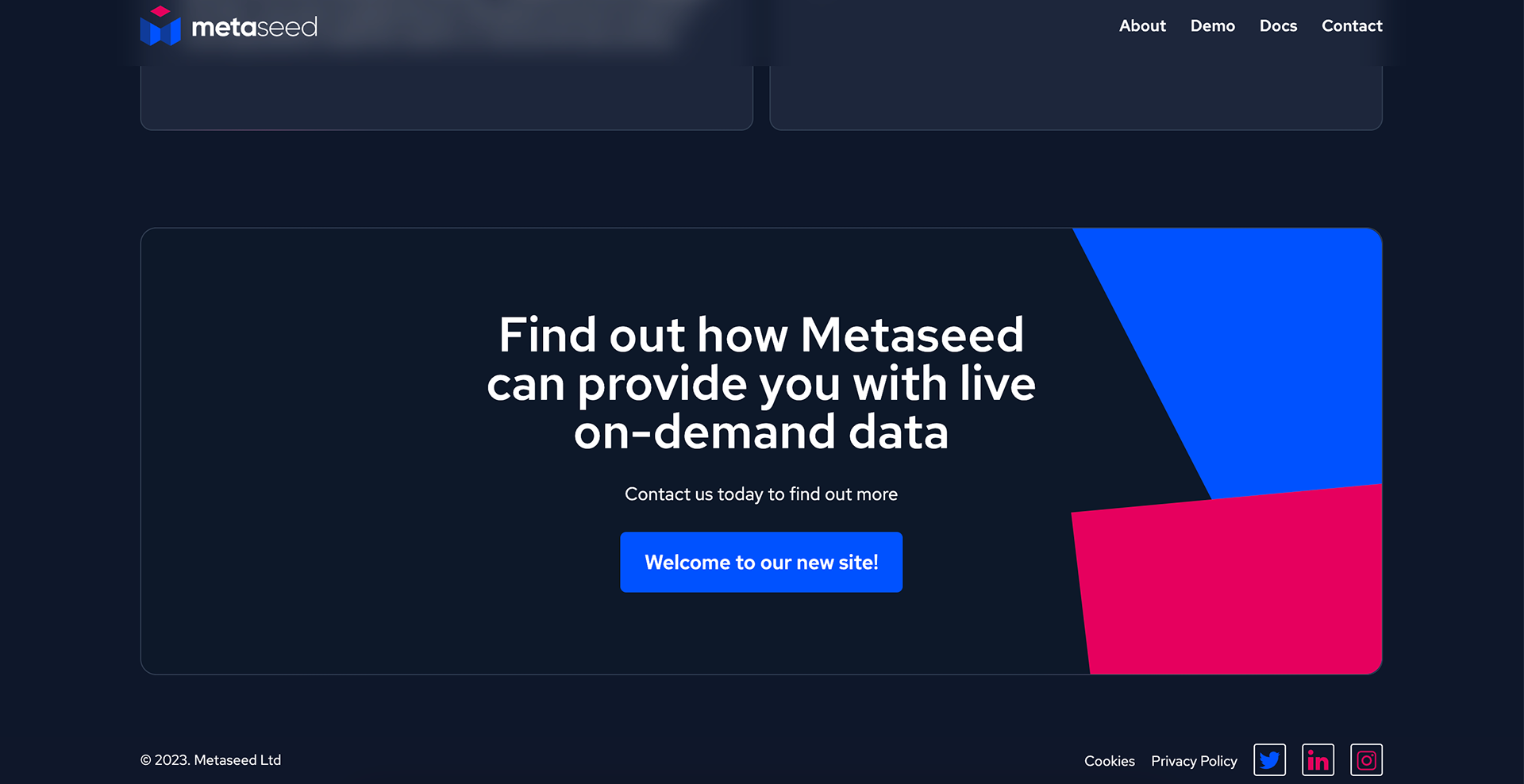
New website
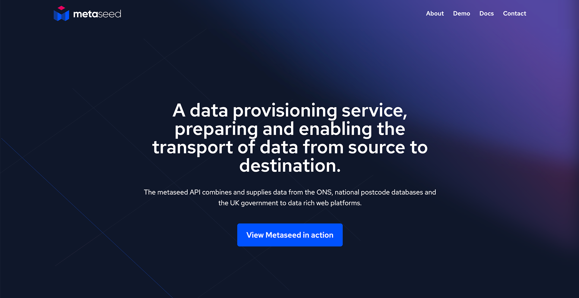
New website
I had created a series social media templates with different purposes which could be adapted and reused over time.
Here is some of my process on Illustrator.
Here is some of my process on Illustrator.
The graphics on the original site featured these characters.I felt they were somewhat generic graphics and didn't really say much about Metaseed's services.
I also felt this was not a good representation of us as a company;
it felt impersonal.
I also felt this was not a good representation of us as a company;
it felt impersonal.
