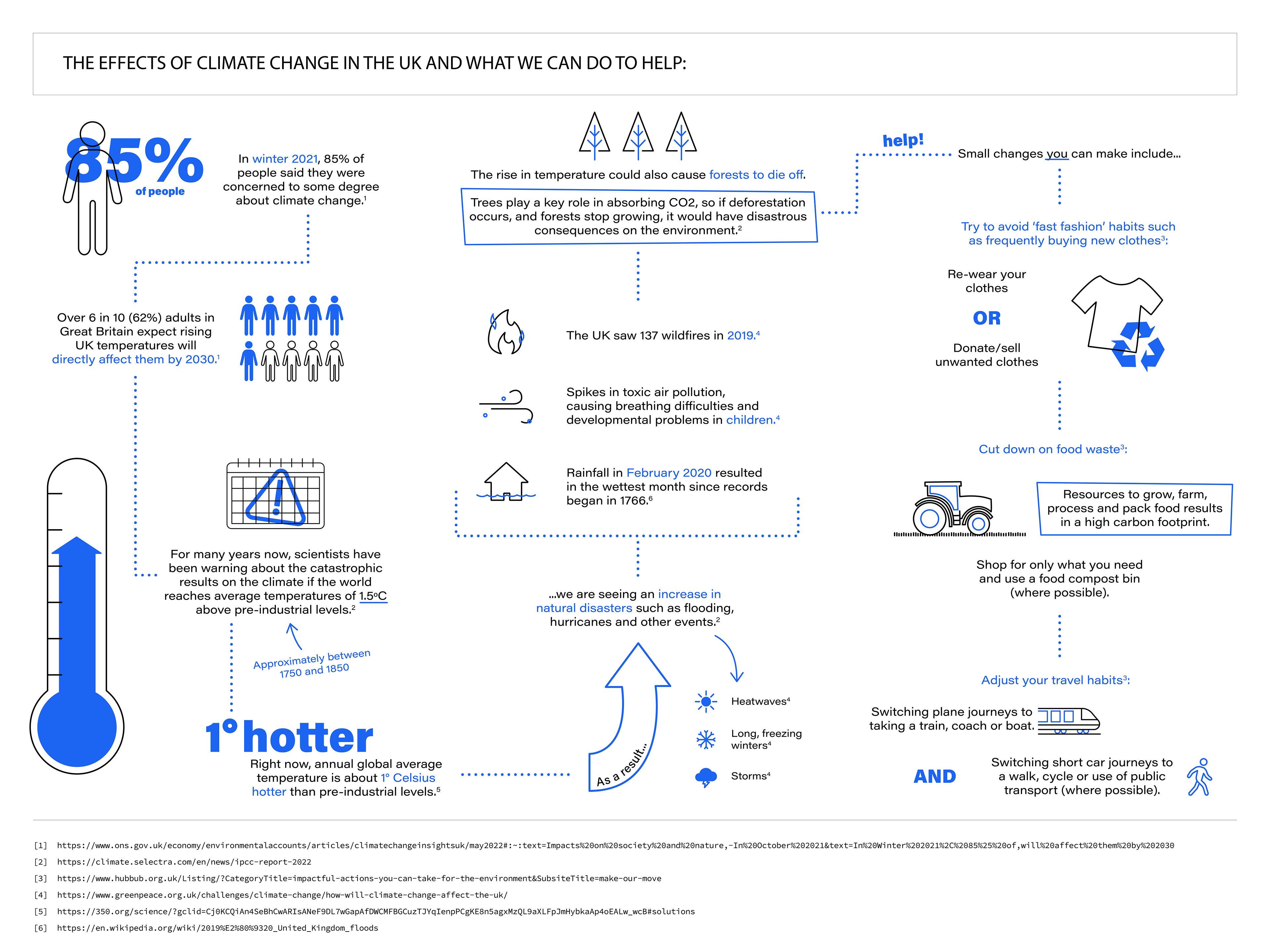
This infographic was designed during my time working for a previous company, with the aim of creating a clear and engaging visual asset for both their website and social media platforms.
Above is the V1 design which I presented to my team and the piece was later adapted as part of our Earth Day 2023 post for social media.
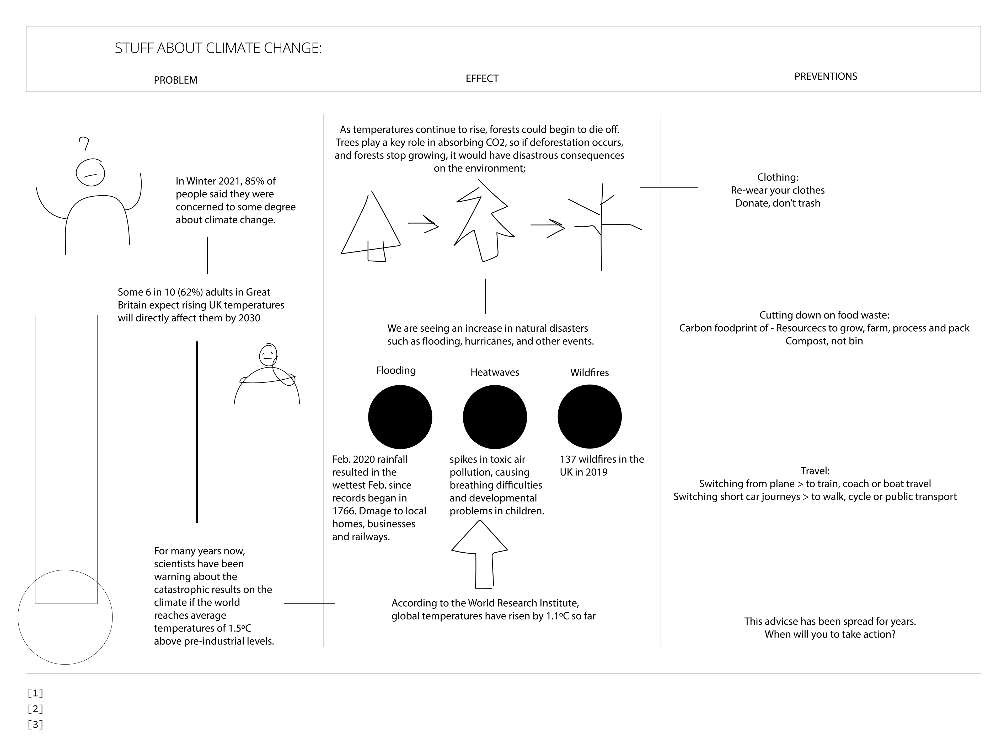
This is the original sketch for the layout of the landscape infographic. Here you can see the page being split into 3 columns, showing 'problem', ' effect' and 'preventions' to guide the viewer through the page from left to right.
Layout 2
Layout 2.2
Final (Portrait)
During the design process the company had changed their template for social media posts to a portrait layout.
This meant I had to rethink the 3 columns concept and instead introduced a traffic light colour palette to emphasis the goal of positive change.
The concept on the right was the final version of this layout, and includes a globe illustration to immediately show the theme of the infographic.
(Click to expand)
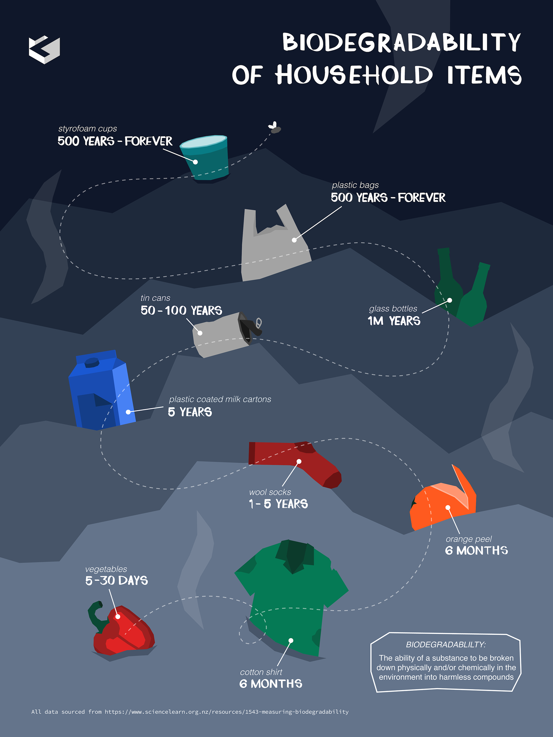
Whilst working for the same company, we were challenged to each create an infographic for a randomly assigned a topic, as a design exercise - my theme being biodegradability.
We were able to submit multiple versions of our infographics before the final showcase, which was good practice for writing and interpreting feedback.
We were able to submit multiple versions of our infographics before the final showcase, which was good practice for writing and interpreting feedback.
After narrowing down my statistics into a timeline format, I started to put together a layout/concept. I struggled to use the landfill-like pile of rubbish without my team interpreting it as a cross section of a hill, which ultimately looked like the timeline was back-to-front!
My final design brings all the 'focus items' into the foreground to avoid this confusion. I also included some hand drawn typography and uses the path of a fly to show direction of the timeline.
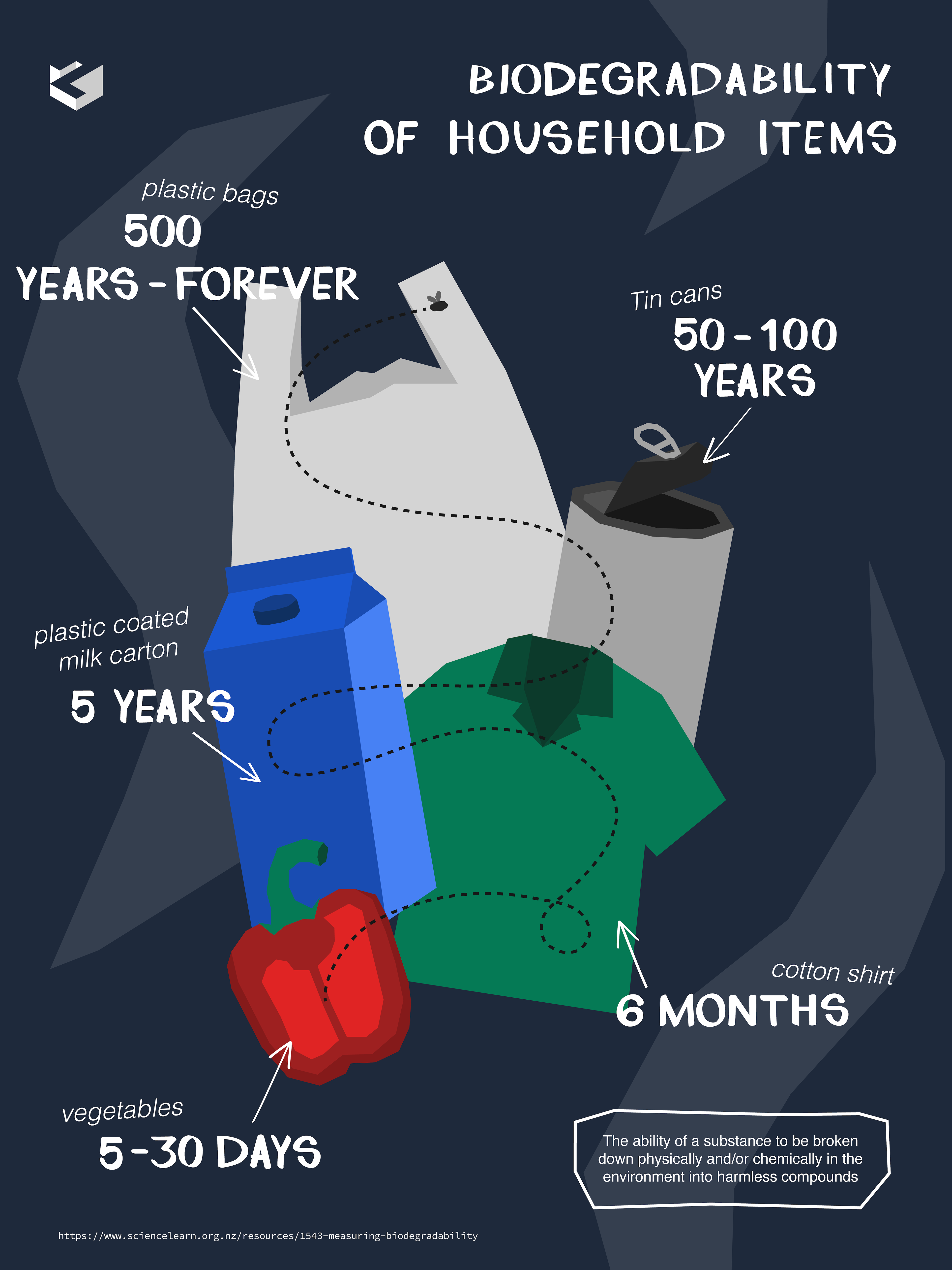
Version 1
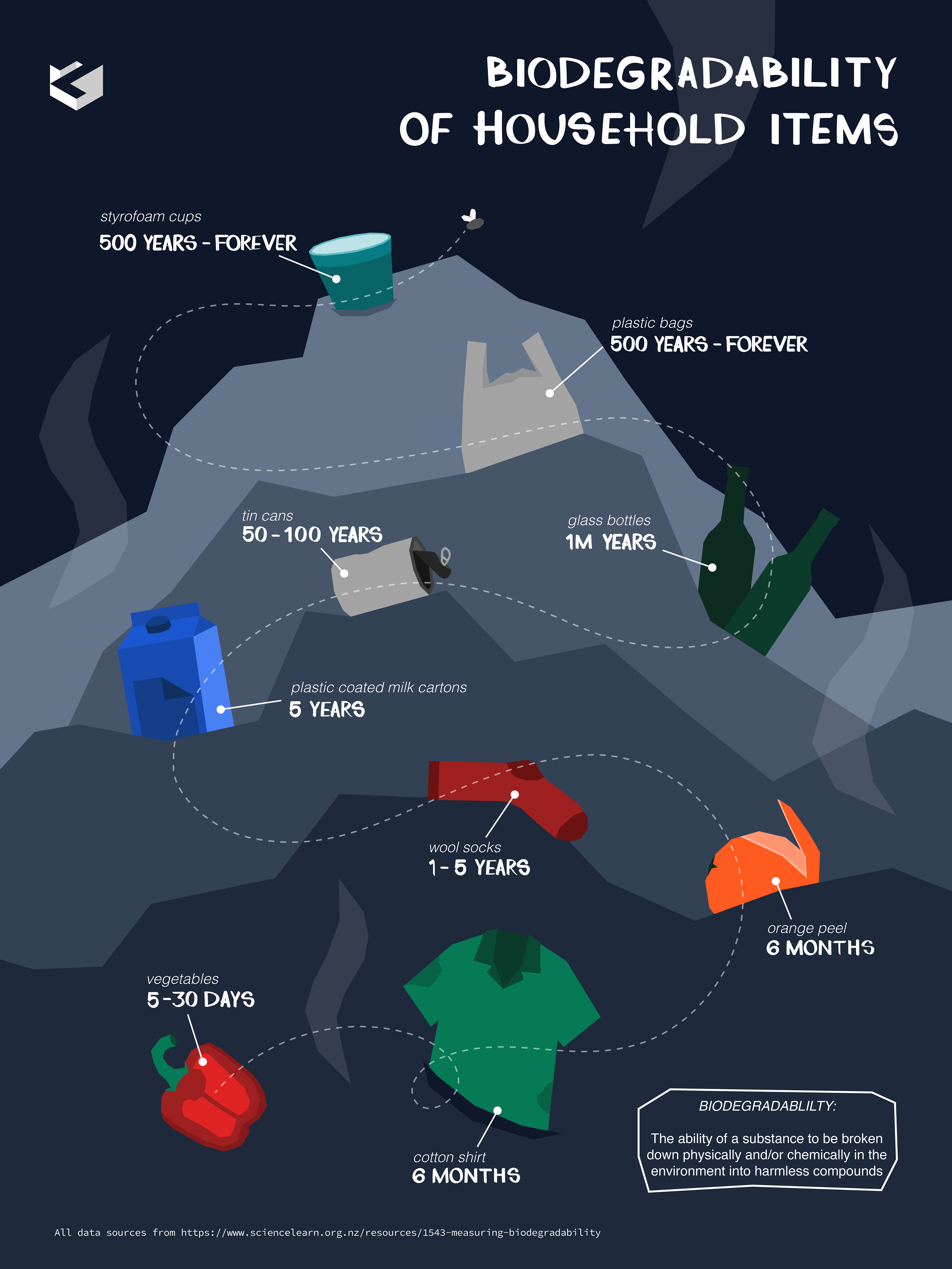
Version 2