Style Guide:
My first task when joining Percipio was to pitch and implement a rebrand for the company. This would be used on the website, in reports and on social media.
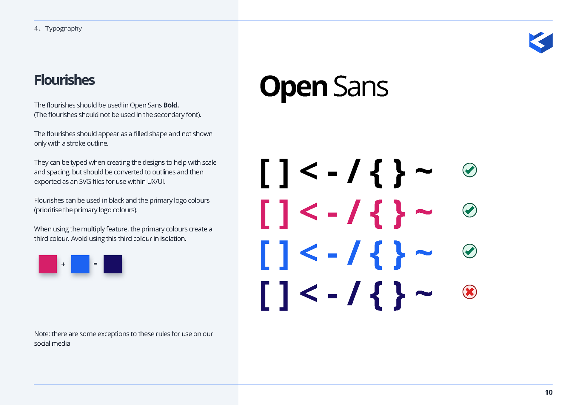
The only guidelines put in place at the time was the logo, colour palette and typefaces. I decided to introduce these type-as-image style 'flourishes' using characters commonly used by developers when coding. This was to show that the company provided both development and design services.
Because the whole team would be using these new branding rules, I had to create a full style guide. Prior to this, I had only created simple 1 page style sheets for myself, but because this branding needed to be used by a team of 10, everyone needed to have a set of clear rules.
I remained the brand ambassador for Percipio, doing the final checks on anything produced to represent us. Here are some of the pages from the style guide, which included both written and illustrated "do's and don'ts" for the new branding.
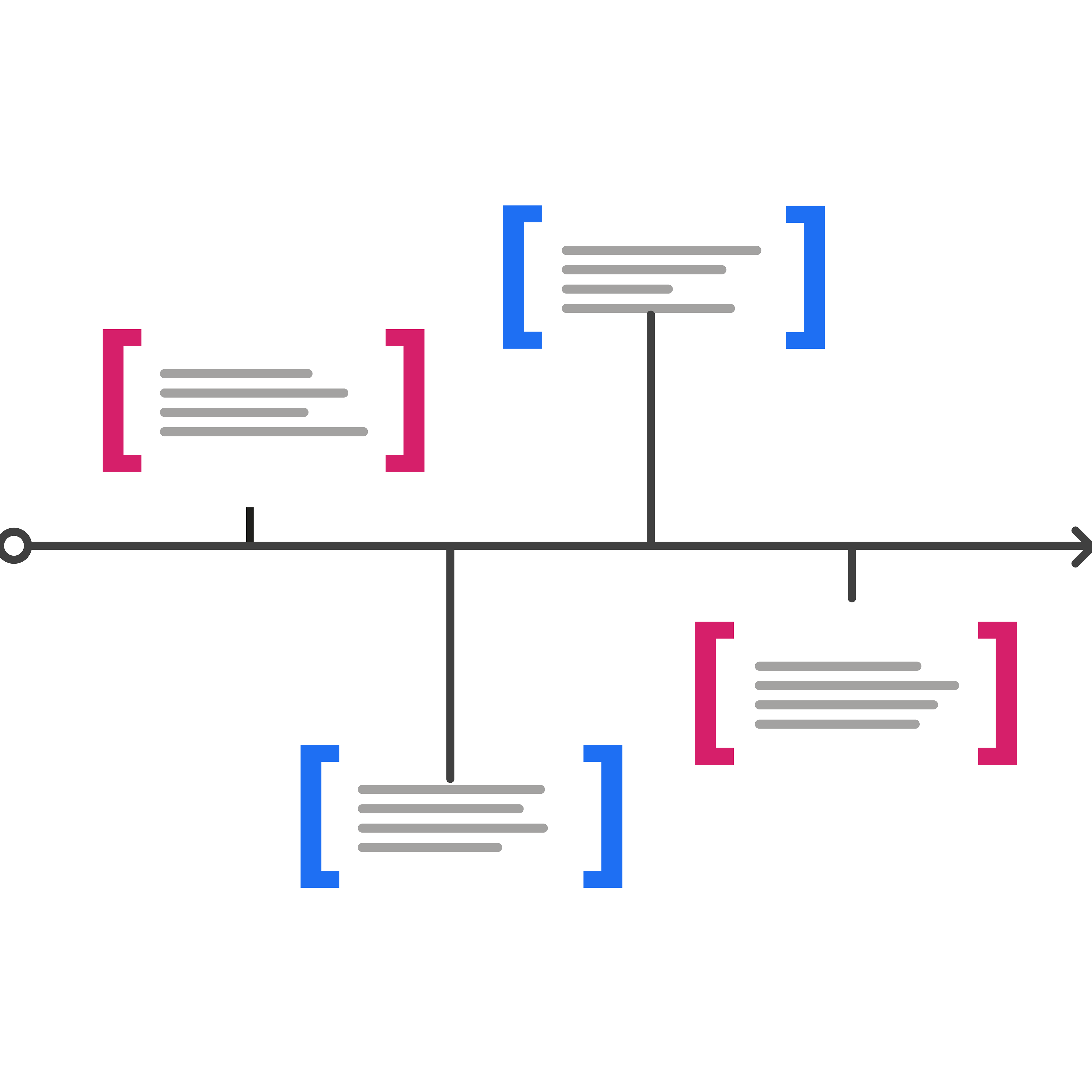
Flourishes
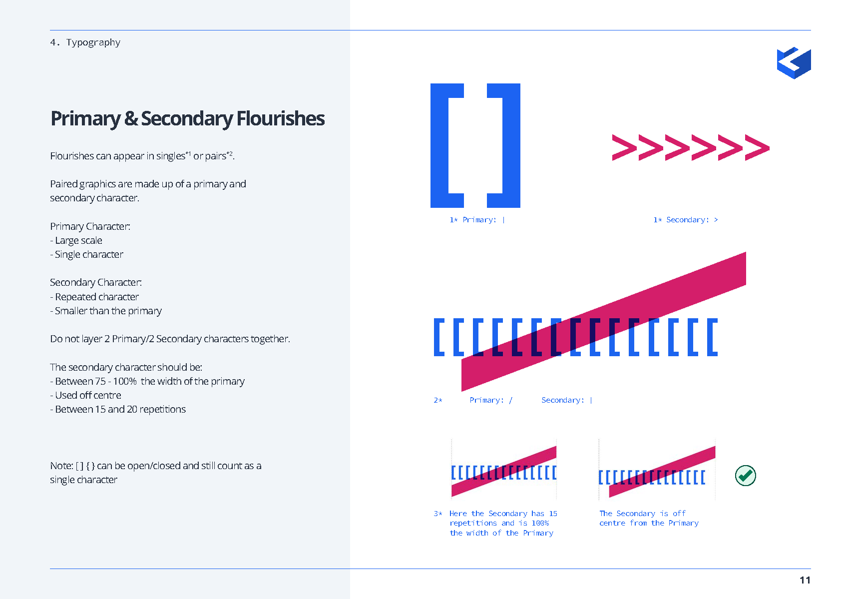
Primary & secondary flourishes
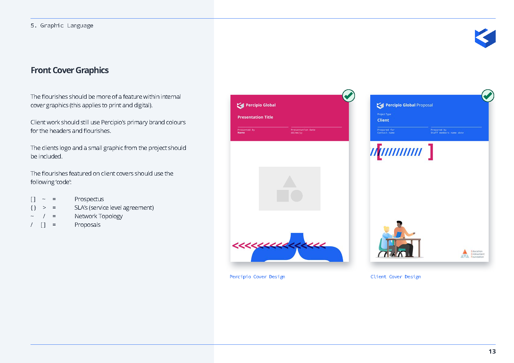
Cover graphics
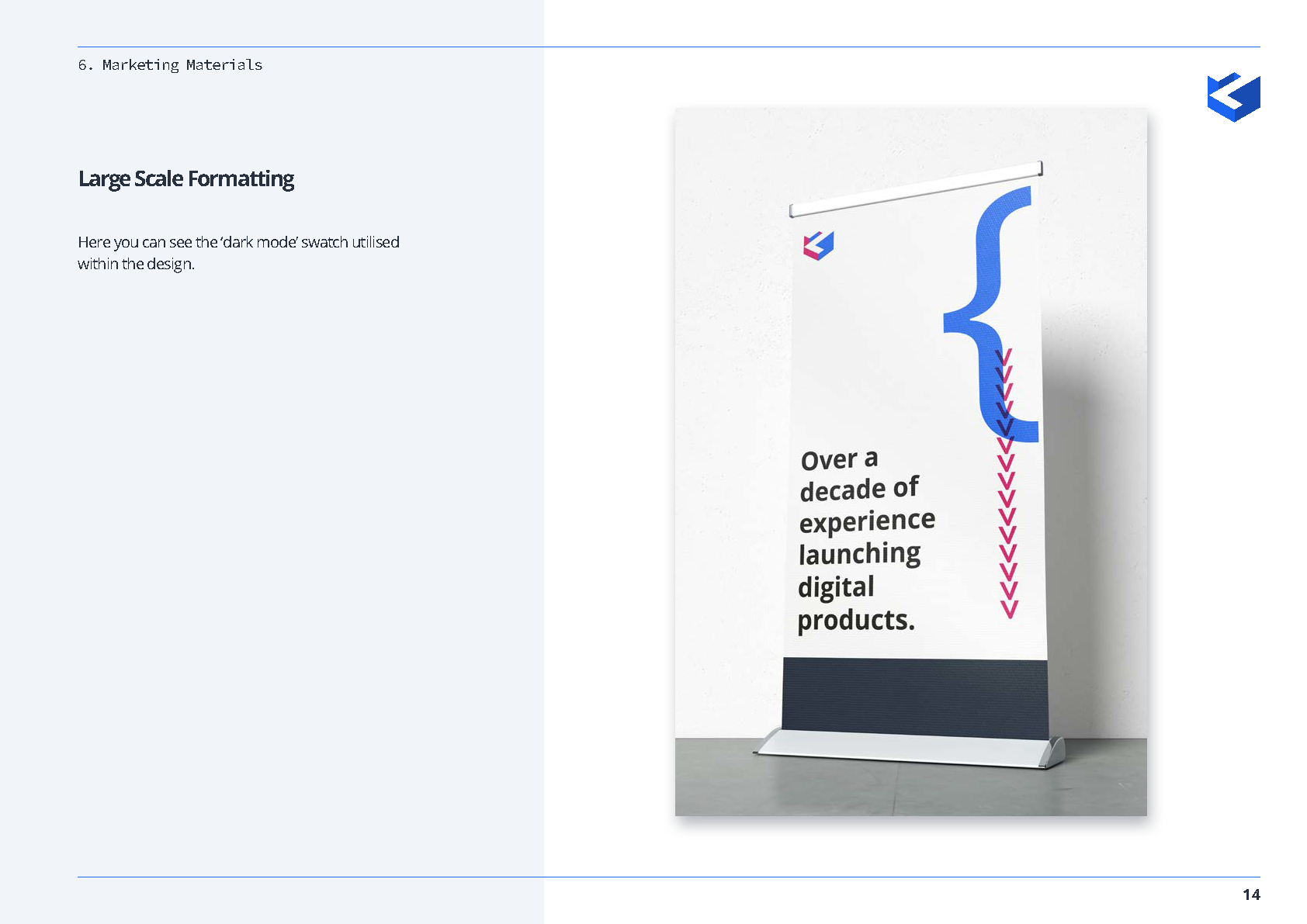
Large scale formatting
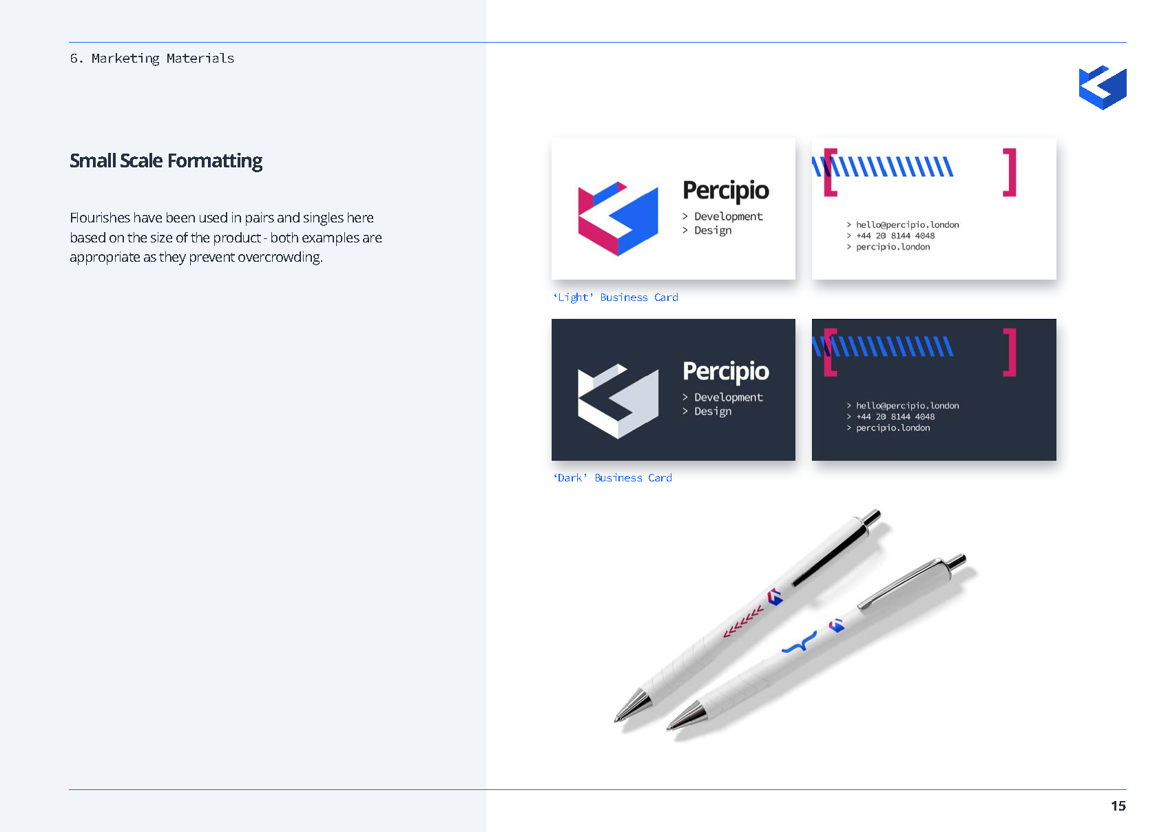
Small scale formatting
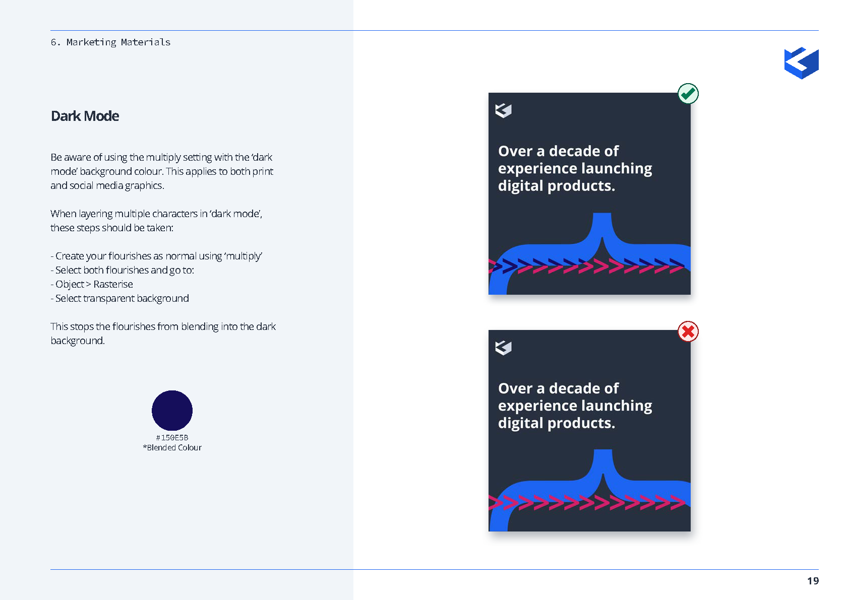
Dark mode
Website Integration:
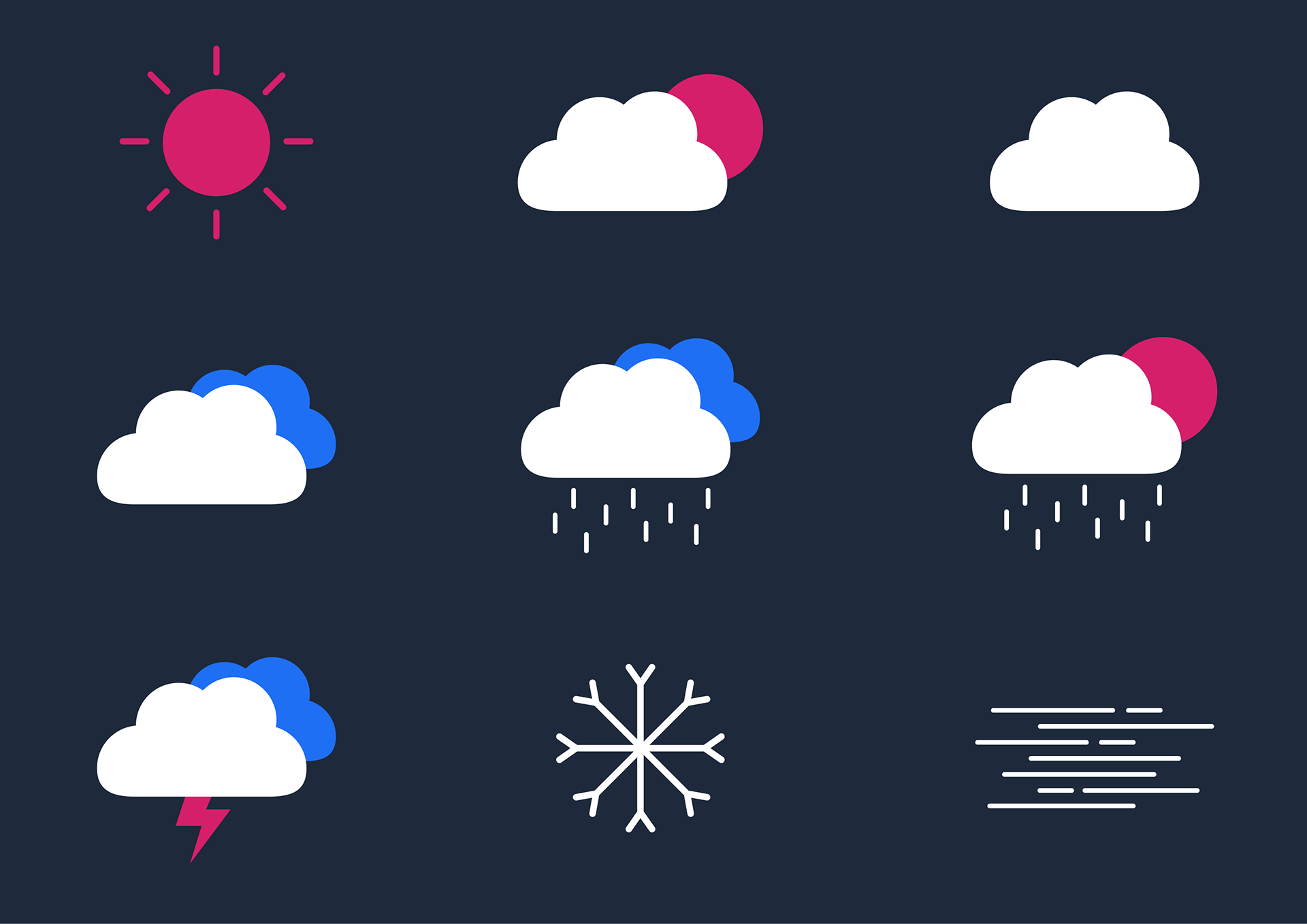
These weather icons were a design request given by the dev team. Once drawn, I handed them over to the developers, and they created a functioning, live, weather chart for the footer of the website.
About

Blogs

Jobs
Our Work

Plugins

The Team
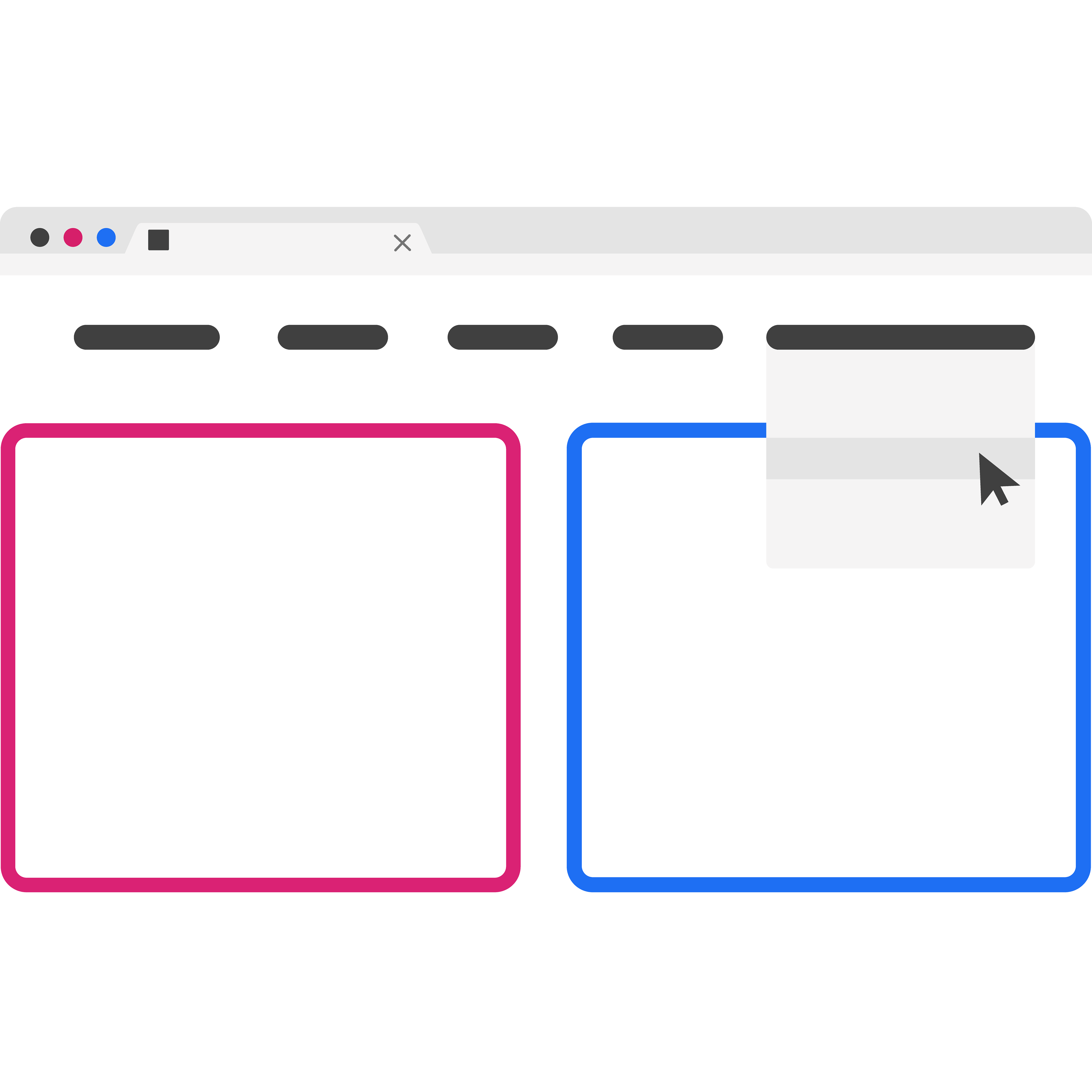
These page icons were created to introduce more graphics onto the website, as the company wanted to push and expand the design team, and gain new 'design only' clients.
Every landing page on the site has its own icon (click to expand).
Every landing page on the site has its own icon (click to expand).
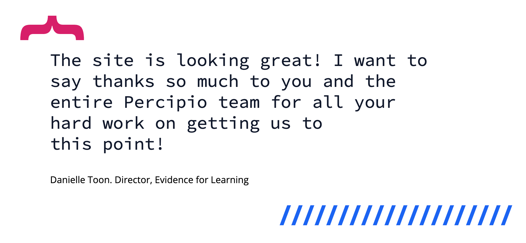
Client quotes (Project showcases)
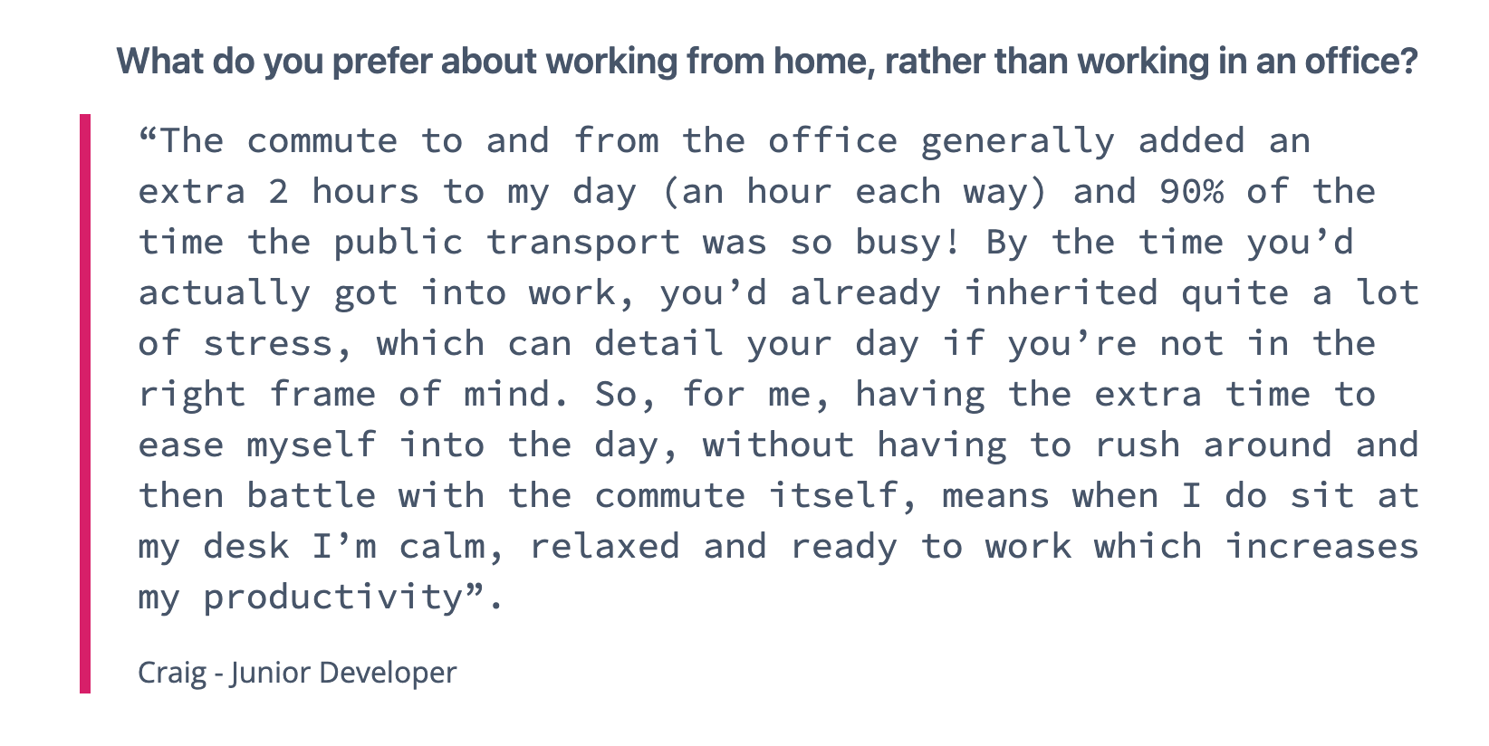
Interview questions (Blogs)
Here you can see the flourishes and simplified details being used throughout the website.
These were added to show when someone other than the author is speaking, without needing traditional symbols like large speech marks or speech bubbles.
I worked closely with the Craig (Junior Developer) to get these designs correctly implemented on the site, and the whole team were able to use them when styling their blog posts or project showcases.
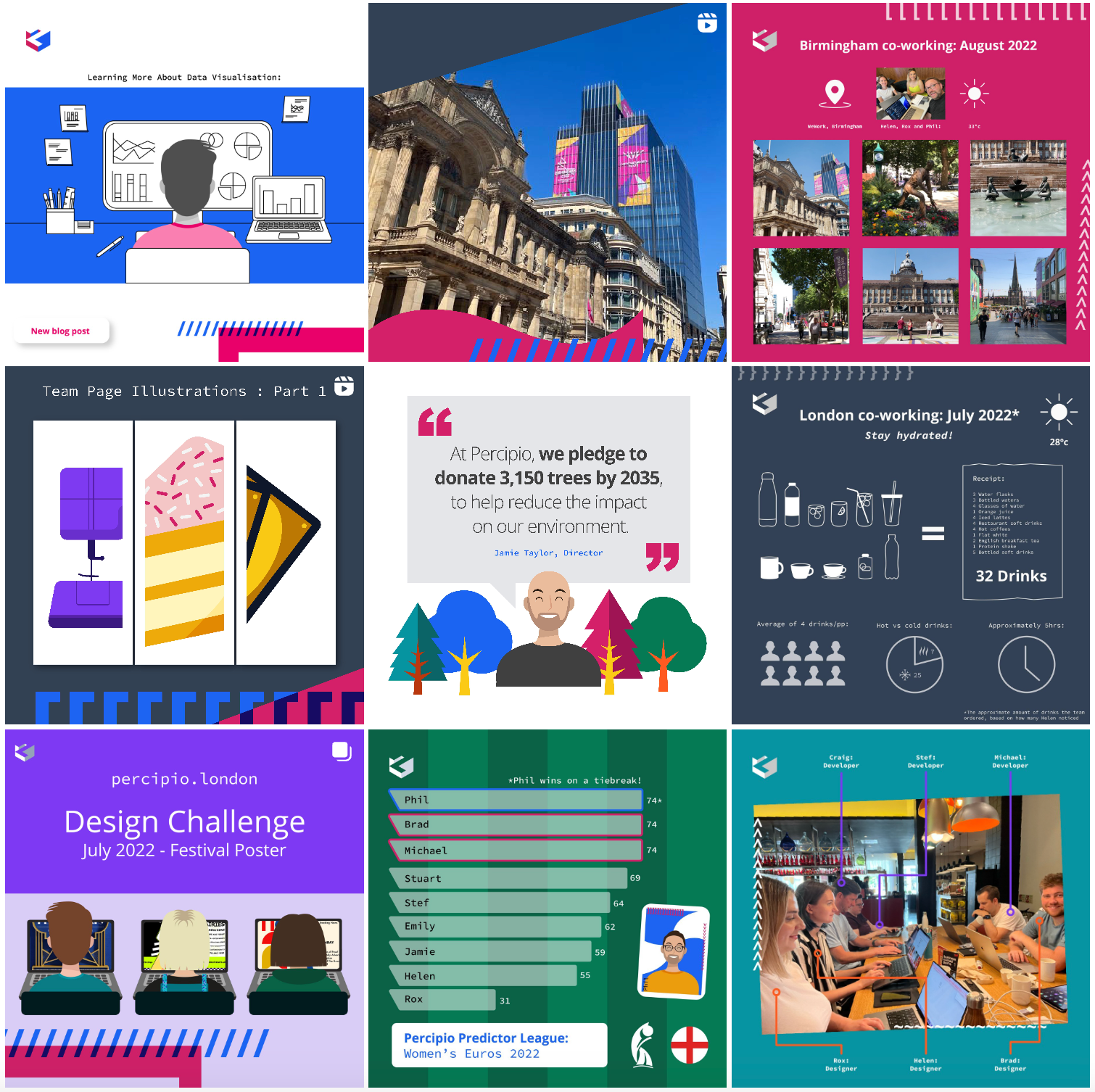
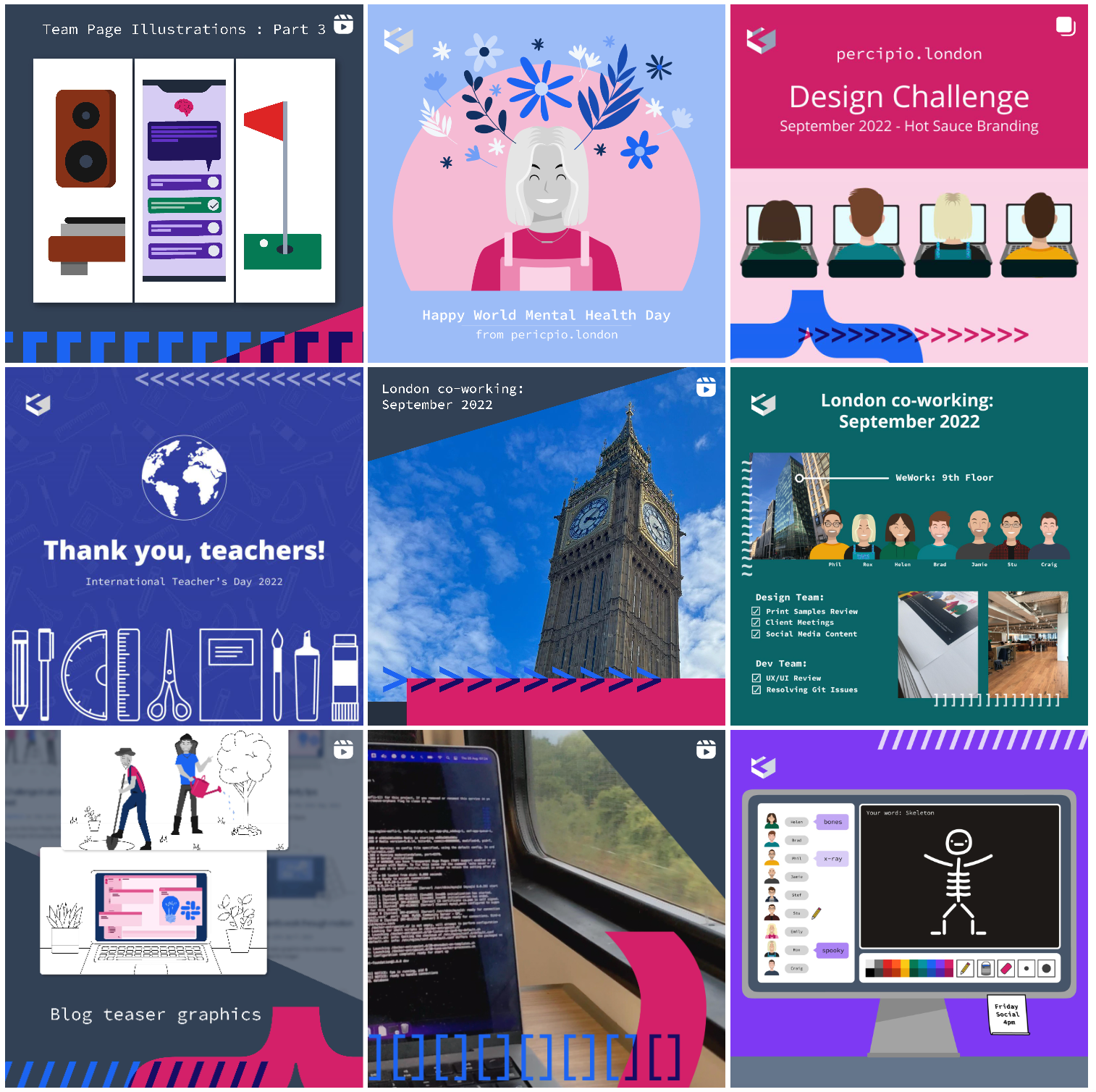
Here are some examples from the social media posts after the rebrand. Myself and another designer were the primary social media team and we wanted to pull more focus on the brands primary colours (pink and blue).
We also decided make more use of the existing avatar illustrations of the team, to make us more personable.
You can see the full colour pallets being utilised throughout, and the character flourishes being added to many posts and video thumbnails.
We also decided make more use of the existing avatar illustrations of the team, to make us more personable.
You can see the full colour pallets being utilised throughout, and the character flourishes being added to many posts and video thumbnails.