I reached out to an artist who was looking for a new logo for them and their band. This project involved a lot of editing and compromise for the final design as the artist had a clear vision of what they wanted for their logo. I was able to have some discussion with the client and provide my design input and suggest more effective design ideas.

Clients original pitch
My pitch
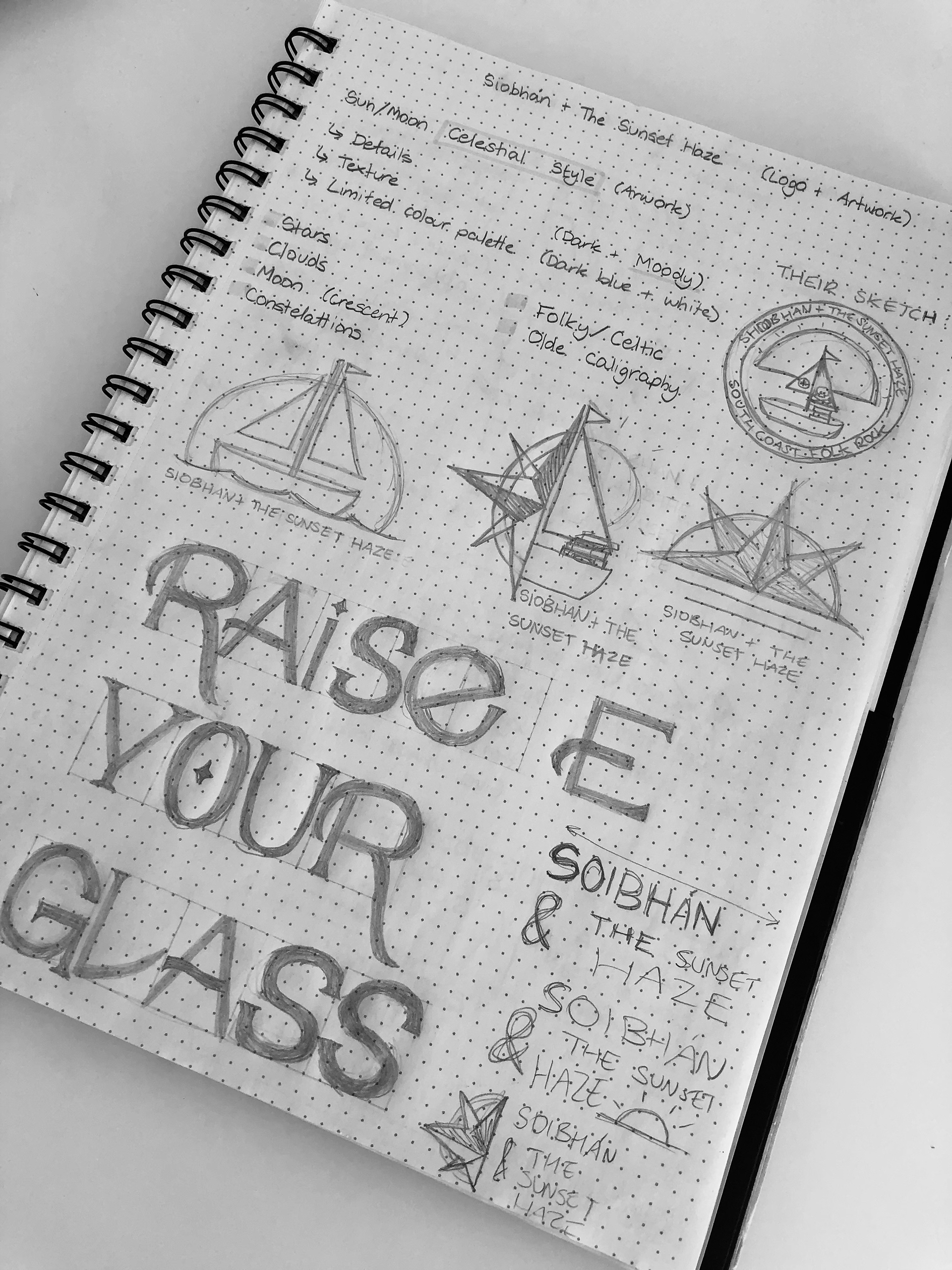
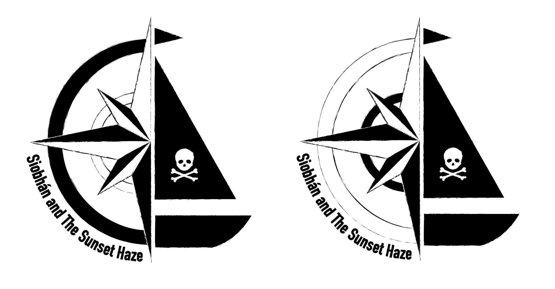
The design on the left is the clients original pitch. I wanted to create a rough version of the logo, so that I could explain why I felt this was an ineffective design, as well as present them with an alternative (middle and right designs).
I felt that their concept had too many elements included for a logo, with some very small details. The client also asked for a lot of colour to be included, which I felt was distracting, and would make it difficult to include on future designs (such as posters and album art).

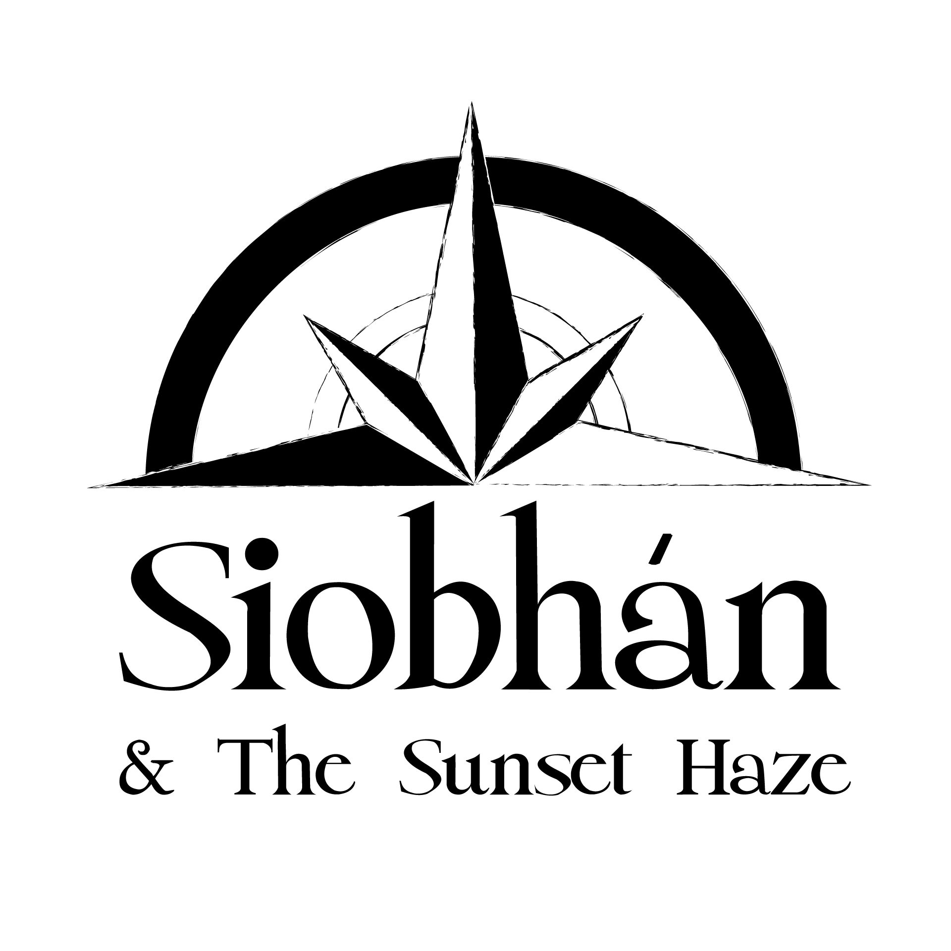
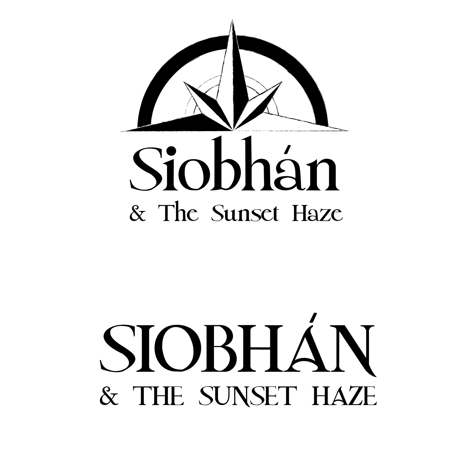
Experiments with typographic logos
Concepts sent to client for review
After sending the previous work, my client agreed with my input and decided that they liked the large compass concept I had created, but still weren't happy. They decided that they wanted something even more simplified, and provided a font for me to use. After creating multiple typography based designs, I went back to them and pitched the two concepts on the right.
This is the clients final choice: